Cool Animated CSS3 Menu Tutorial
This tutorial is about understanding, learning and mastering the some of the new features and properties of CSS3.You will learn how to build a cool rounded navigation menu, with no images and no Javascript, and effectively make use of the new CSS3 properties
border-radius and animation.This menu works perfectly well with Chrome and Safari. With Firefox the
border-radius works great but not the animation.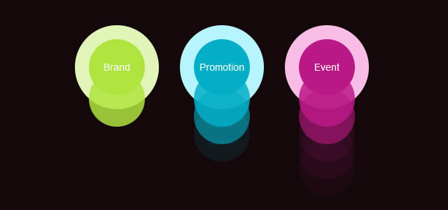
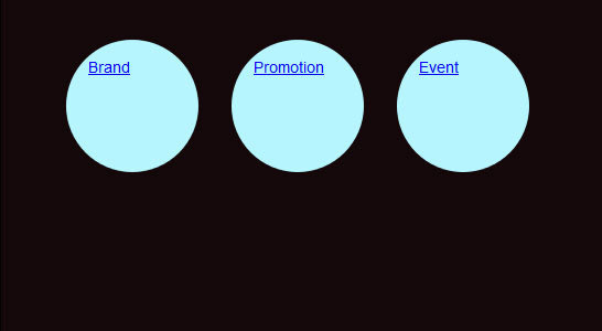
Step 1: The HTML structure of the Navigation
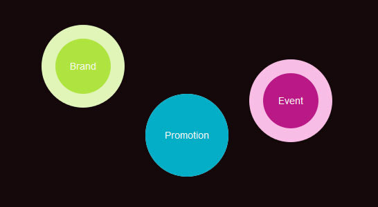
The basic HTML structure of the menu has three list items with the fictitious names “brand“, “promotion” and “event“.<ul>
<li id="brand"><a href="#">Brand</a></li>
<li id="promotion"><a href="#">Promotion</a></li>
<li id="event"><a href="#">Event</a></li>
</ul>
How the menu looks so far:

Step 2: Create the Background Color of the Menu
In this step we are going to give the main navigation area (.css3Tutorial) a dark background. Thewidth, height and padding are completely optional, they are only there for demonstartion purposes when viewing the demo. .css3Tutorial { background: #14080a; width:506px; height:260px; padding:20px; } |

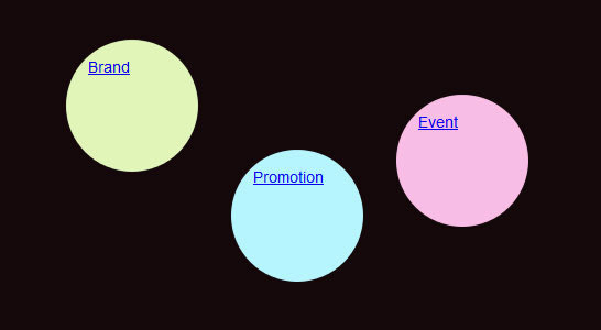
Step 3: Round Navigation with border-radius
Now we will make each .li (navigation item) rounded with some cool CSS3 magic, more specifically with the border-radius property: So far, the navigation will work very well with Chrome, Safari and Firefox. ul { list-style: none; } li { float:left; font: 14px/10px Arial, Verdana, sans-serif; color:#FFF; background-color: #b6f5fe; width: 80px; height: 80px; padding:20px; margin:0 30px 0 0; -webkit-border-radius: 60px; -moz-border-radius: 60px; border-radius: 60px; } |
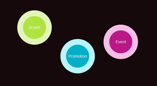
Step 4: Aligning the Navigation Points
In this fourth step, we will give each.li element (navigation item) a unique background-color and position: li#brand { background-color: #e1f5b8; } li#promotion { background-color: #b6f5fe; margin-top:100px; } li#event { background-color: #f9bde6; margin-top:50px; } |
Step 5: Aligning the Links within the Menu
li a { color:#FFF; text-decoration:none; display:block; width: 80px; height: 45px; text-align: center; padding:35px 0 0 0; margin:0 40px 0 0; -webkit-border-radius: 40px; -moz-border-radius: 40px; border-radius: 40px; } li#brand a { background-color: #afe43f; } li#promotion a { background-color: #03aec7; } li#event a { background-color: #ba1886; } |
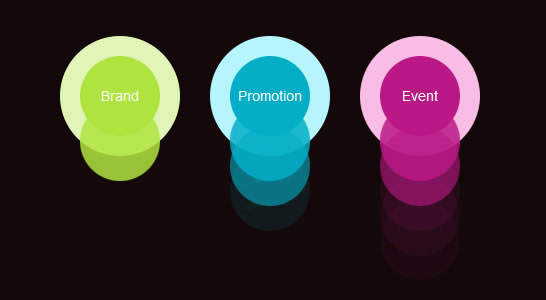
Step 6: Define the Properties for the Hover Effect
In terms of a “good user experience” we will now add the hover effect for the “inner core” of our navigation:li a:hover, li a:focus, li a:active { width: 120px; height:65px; padding:55px 0 0 0; margin:-20px 0 0 -20px; -webkit-border-radius: 60px; -moz-border-radius: 60px; border-radius: 60px; } |
Step 7: Adding the animation to the Navigation
Now this were the navigation really comes alive. The animation property for this navigation works perfectly with Chrome anf Safari, but struggles with Firefox. li a:hover, li a:focus, li a:active { -webkit-animation-name:bounce; -webkit-animation-duration:1s; -webkit-animation-iteration-count:4; -webkit-animation-direction:alternate; } @-webkit-keyframes bounce{from{margin:0 40px 0 0;} to{margin:120px 40px 0 0;} } |


No comments:
Post a Comment