Cool Animated CSS3 Menu Tutorial
This tutorial is about understanding, learning and mastering the some of the new features and properties of CSS3.
You will learn how to build a cool rounded navigation menu, with no images and no Javascript, and effectively make use of the new CSS3 properties
border-radius and
animation.
This menu works perfectly well with Chrome and Safari. With Firefox the
border-radius works great but not the
animation.
Step 1: The HTML structure of the Navigation
The basic HTML structure of the menu has three list items with the fictitious names “
brand“, “
promotion” and “
event“.
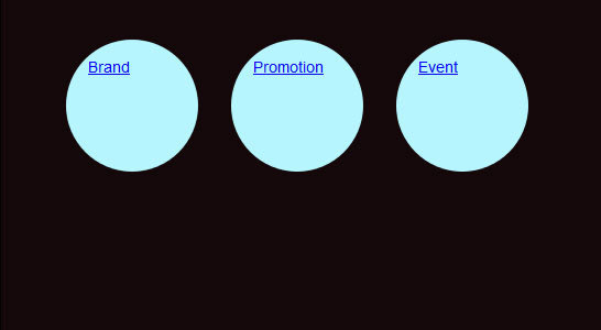
<ul>
<li id="brand"><a href="#">Brand</a></li>
<li id="promotion"><a href="#">Promotion</a></li>
<li id="event"><a href="#">Event</a></li>
</ul>
How the menu looks so far:

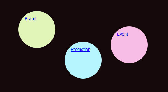
Step 2: Create the Background Color of the Menu
In this step we are going to give the main navigation area (.css3Tutorial) a dark background. The
width,
height and
padding are completely optional, they are only there for demonstartion purposes when viewing the demo.
| .css3Tutorial {
background: #14080a;
width:506px;
height:260px;
padding:20px;
} |
How the menu looks so far:

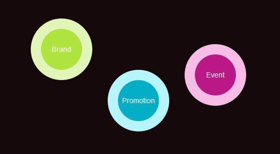
Step 3: Round Navigation with border-radius
Now we will make each
.li (navigation item) rounded with some cool CSS3 magic, more specifically with the
border-radius property: So far, the navigation will work very well with Chrome, Safari and Firefox.
| ul {
list-style: none;
}
li {
float:left;
font: 14px/10px Arial, Verdana, sans-serif;
color:#FFF;
background-color: #b6f5fe;
width: 80px;
height: 80px;
padding:20px;
margin:0 30px 0 0;
-webkit-border-radius: 60px;
-moz-border-radius: 60px;
border-radius: 60px;
} |
How the menu looks so far:
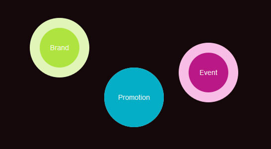
Step 4: Aligning the Navigation Points
In this fourth step, we will give each
.li element (navigation item) a unique
background-color and position:
| li#brand {
background-color: #e1f5b8;
}
li#promotion {
background-color: #b6f5fe;
margin-top:100px;
}
li#event {
background-color: #f9bde6;
margin-top:50px;
} |
How the menu looks so far:
Step 5: Aligning the Links within the Menu
| li a {
color:#FFF;
text-decoration:none;
display:block;
width: 80px;
height: 45px; text-align: center;
padding:35px 0 0 0;
margin:0 40px 0 0;
-webkit-border-radius: 40px;
-moz-border-radius: 40px;
border-radius: 40px;
}
li#brand a {
background-color: #afe43f;
}
li#promotion a {
background-color: #03aec7;
}
li#event a {
background-color: #ba1886;
} |
How the menu looks so far:
Step 6: Define the Properties for the Hover Effect
In terms of a “good user experience” we will now add the hover effect for the “inner core” of our navigation:
| li a:hover,
li a:focus,
li a:active {
width: 120px;
height:65px;
padding:55px 0 0 0;
margin:-20px 0 0 -20px;
-webkit-border-radius: 60px;
-moz-border-radius: 60px;
border-radius: 60px;
} |
How the menu looks so far:
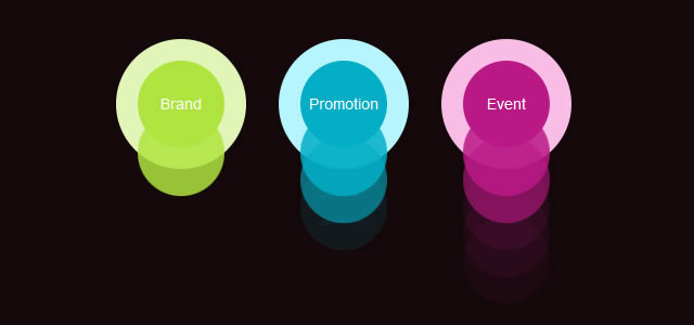
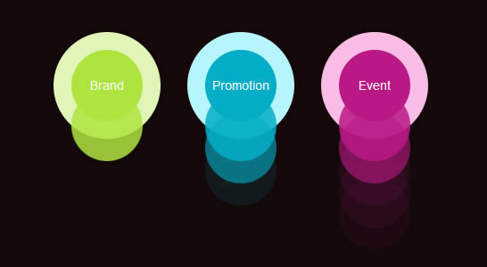
Step 7: Adding the animation to the Navigation
Now this were the navigation really comes alive. The
animation property for this navigation works perfectly with Chrome anf Safari, but struggles with Firefox.
| li a:hover,
li a:focus,
li a:active {
-webkit-animation-name:bounce;
-webkit-animation-duration:1s;
-webkit-animation-iteration-count:4;
-webkit-animation-direction:alternate;
}
@-webkit-keyframes bounce{from{margin:0 40px 0 0;}
to{margin:120px 40px 0 0;}
} |
How the final menu looks:


